Research / Technology
Typography New.0
What new requests do we make of typography? How do we push past the limits of existing design software and build instruments of our own — ones that treat typography as image, and give it parameters that ask it to do things it has not been asked to do before?
This is where we test our thinking.
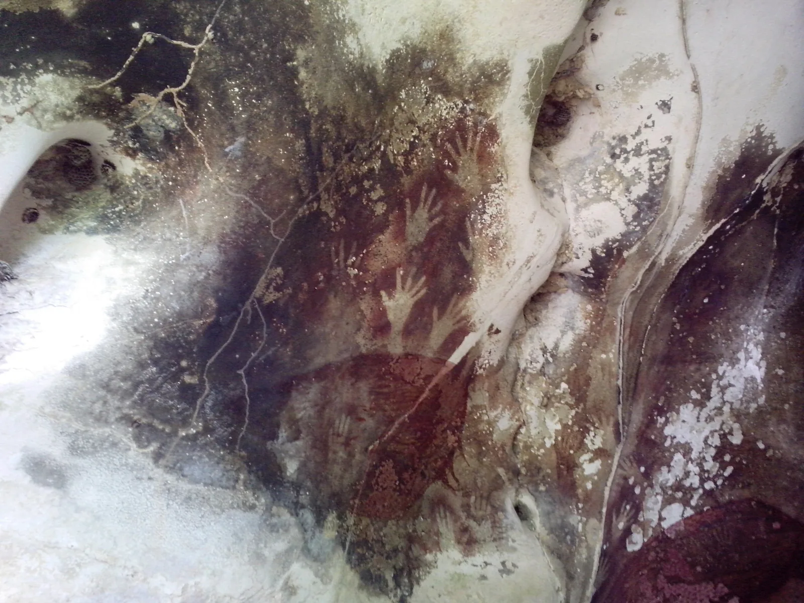
Typography has always stood beside technology. It has never been a fixed set of shapes. It has been whatever the available machine allowed a mark to do, and each change has been shaped by the culture that wanted something said and the technology that could say it. The first of those machines was a hand. Stencils in the caves of Sulawesi, dated to at least 67,800 years ago, show pigment blown over a hand pressed to rock: a matrix, an ink, a substrate, and a mark that could be made again. Before anyone had a letter, someone had a reproducible mark and a reason to repeat it.
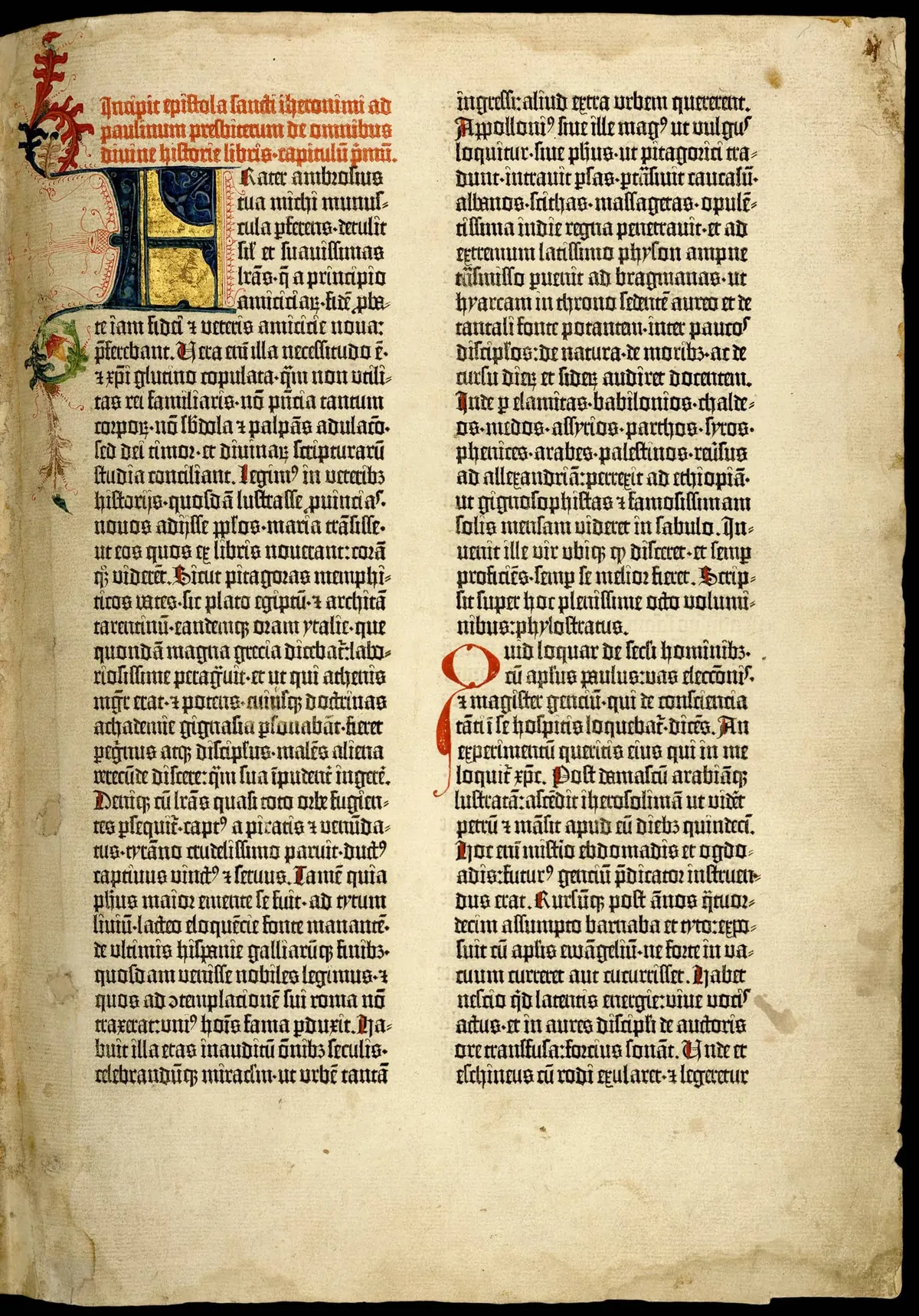
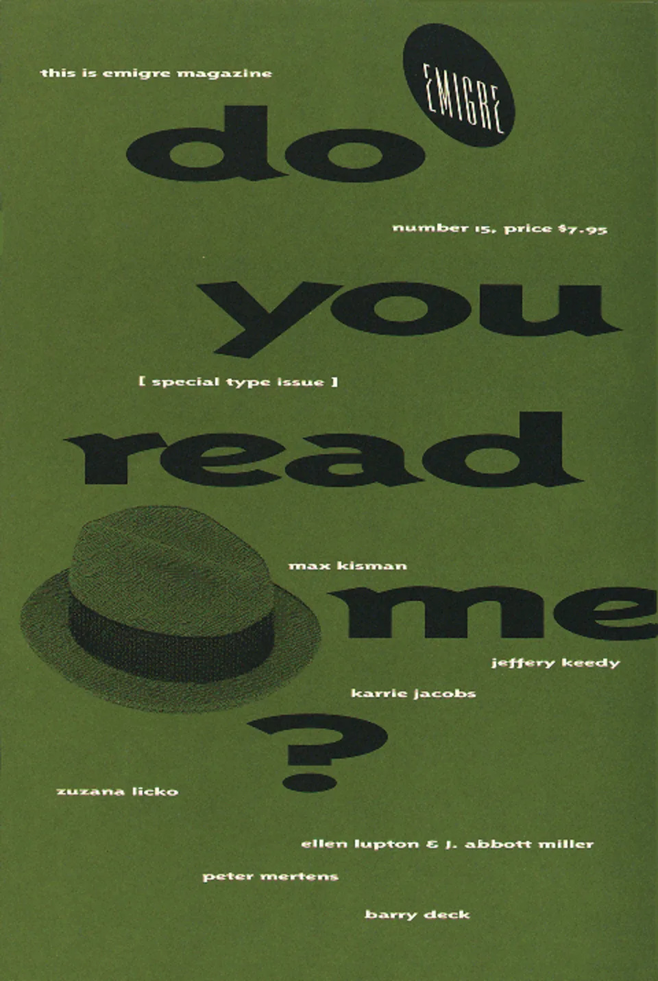
Each new machine began by imitating the last. Gutenberg’s type copied the scribes’ blackletter, with hundreds of variant characters cut so a machine could reproduce the irregularity of a hand. The first digital faces were drawn from metal, and the first variable fonts were mostly existing families given axes. The convention travels with the technology until someone finds what the new machine can do that the old ones couldn’t. For typography that moment came in the mid-1980s with the Macintosh, PostScript and the laser printer. Emigre3, FUSE1, and in Chicago Rick Valicenti’s Thirstype and Carlos Segura’s T-26 were designers who wanted particular letters to exist and built the means to release them. Soon anyone could make a typeface from their own handwriting in an afternoon.
Yet type still sat still. Whatever its source, a font was a file, and every instance it produced was identical. Variable fonts, announced in 2016, conceded that a typeface is a space of possibilities rather than a single form. But an axis is a control with nothing behind it; nothing in the file has any physics. Meanwhile the industry consolidated, and Monotype and Adobe now set the working norm, one that favors the typefaces that license well. Independent practice didn’t disappear; it took on work the industry had set aside. Future Fonts releases typefaces before they are finished, sells version 0.1, and lets buyers watch a design develop in public. Type Electives teaches type design online, outside any degree program, to anyone who turns up. These initiatives are doing more than selling letters. They are teaching, publishing process, and releasing work the conventional model wouldn’t carry. Static typography is in excellent health, drawn better and by more people than ever. Almost all of it, though, still assumes the letter will hold still and be read.
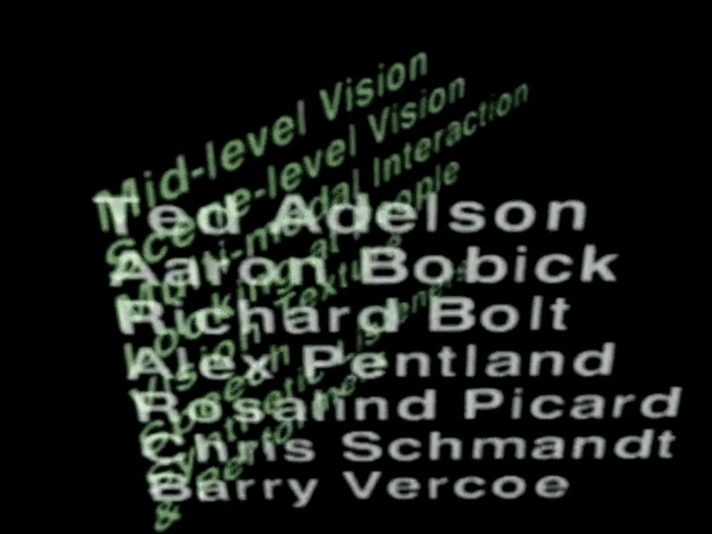
My research starts from that gap. How do we treat typography as image, and what does it become when new variables are introduced to it — ones that exist outside what a variable typeface allows for? The answer I’m testing is that the designer has to build the instrument, not specify it or adjust someone else’s slider. Muriel Cooper’s Visible Language Workshop gave type depth and distance, and John Maeda4 taught designers to write the program themselves. The browser is the cheapest version of that instrument ever made, with no license, install or account, which makes the argument political before it is aesthetic.
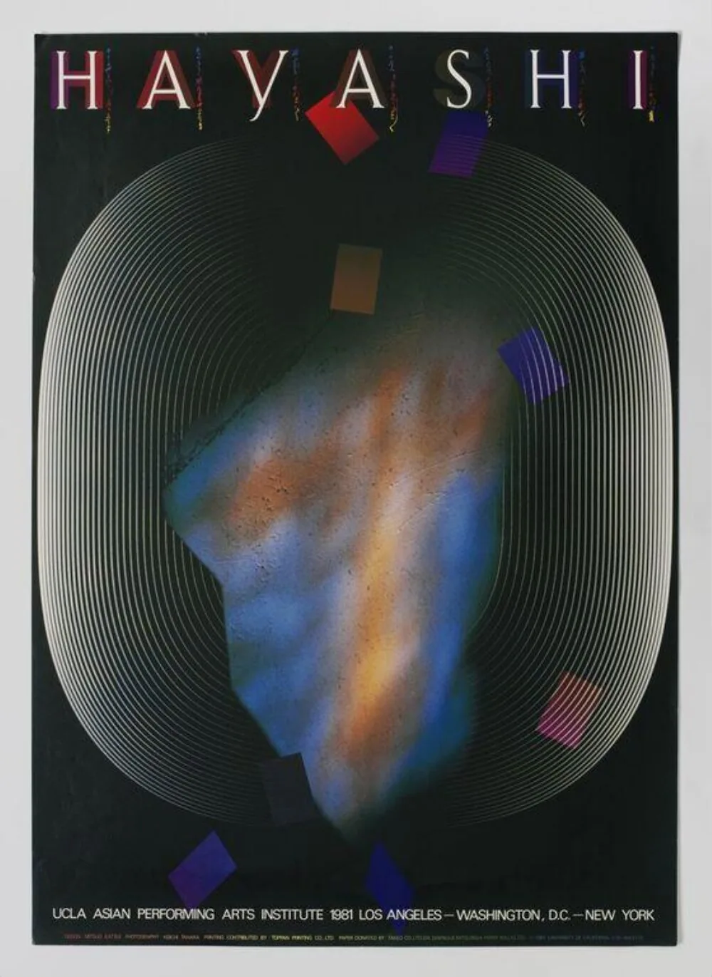
The work is typography as image: the letter itself as the picture, where what you recognize and what you read are the same marks. The precedent is Mitsuo Katsui2, who used the computer as an instrument of visual expression when the industry saw it as production equipment, and for whom the instrument here is named. Legibility is the variable, not the limit. Zuzana Licko argued that we read best what we read most, which makes legibility learned rather than fixed. So the experiment is to travel that axis on purpose: how far a word can be dispersed, smeared, grown or set in motion before it stops being a word, and whether what it becomes is worth anything. That boundary is not a failure state. It is the only place on the axis where anything is learned.
The themes we explore.
No counts: these are open topics, not a tally, and an instrument usually sits on more than one of them.
- Legibility The variable, not the limit — how far a word can be dispersed before it stops being a word. Liquid Type runs that axis from held to dissolved; Connected works the same threshold from the other side, as a field of nodes that stays a word for as long as you hold the shape.
- Motion Movement without animation — a still that has traveled. Mitsuo turns a multiplied letterform about its vertical axis until the copies read as ribs of one object, perspective doing the work a timeline usually does.
- Customization Every instrument is a system rather than a finished picture: weight, dispersal, rhythm, density and color are left open. A mark made here can be tuned to a brand’s palette and proportions instead of arriving with ours baked in. The tool proposes; the brand decides.
Research transformed into applications.
What we make in situ.
- Brody, Neville and Jon Wozencroft, eds. FUSE 1–20. 1991–2000. Collected, Cologne: Taschen, 2012.
- Katsui, Mitsuo. Member profile. Alliance Graphique Internationale.
- Licko, Zuzana. In Emigre 15 (1991). See Gerard Unger, “Legible?”, Emigre.
- Maeda, John. Design By Numbers. Cambridge, MA: MIT Press, 1999.